Journey Pathway
The function of the Dublin Bus App is a priority. With this, task colour becomes important not just for directing but guiding users with design manipulation and patterns that prompt call-to-action and with the flexibility to allow for prompted gestures for users.
In designing for touch, interaction by the viewer is further influenced by interaction zones of either left or right hand compared both hands using the device together. Taking into account that based on interviews and research 80% of DBA accompanies interaction whilst moving, we must account for accessibility of one handed users while also accommodating 10% of the population of left hand user and the remaining right hand users. Around 107,000 Dublin commuters are utilising the service for work daily. Colour is the signifier for action without necessitating detailed attention. Derived from the NTA new colour scheme consisting of blue and white to be brought in in Autumn 2019, the new scheme will be a call to action of direction and mobility in the redesign as blue and white form the backdrop and compartmentalisation of information.
Design and Function
The first design was an amalgamation of distinct features and wireframe choices between Google Maps, N26 and Moovit. According to our heuristics evaluation we proceeded with selecting core features and assigning hierarchy to those.
Touch reach and call-to-actions were important factors due to the number of users in motion whilst using the app because they require less direct attention to avail of required transport information, to allow some independence of their phones to carry out their journey. (Babick, 2016)
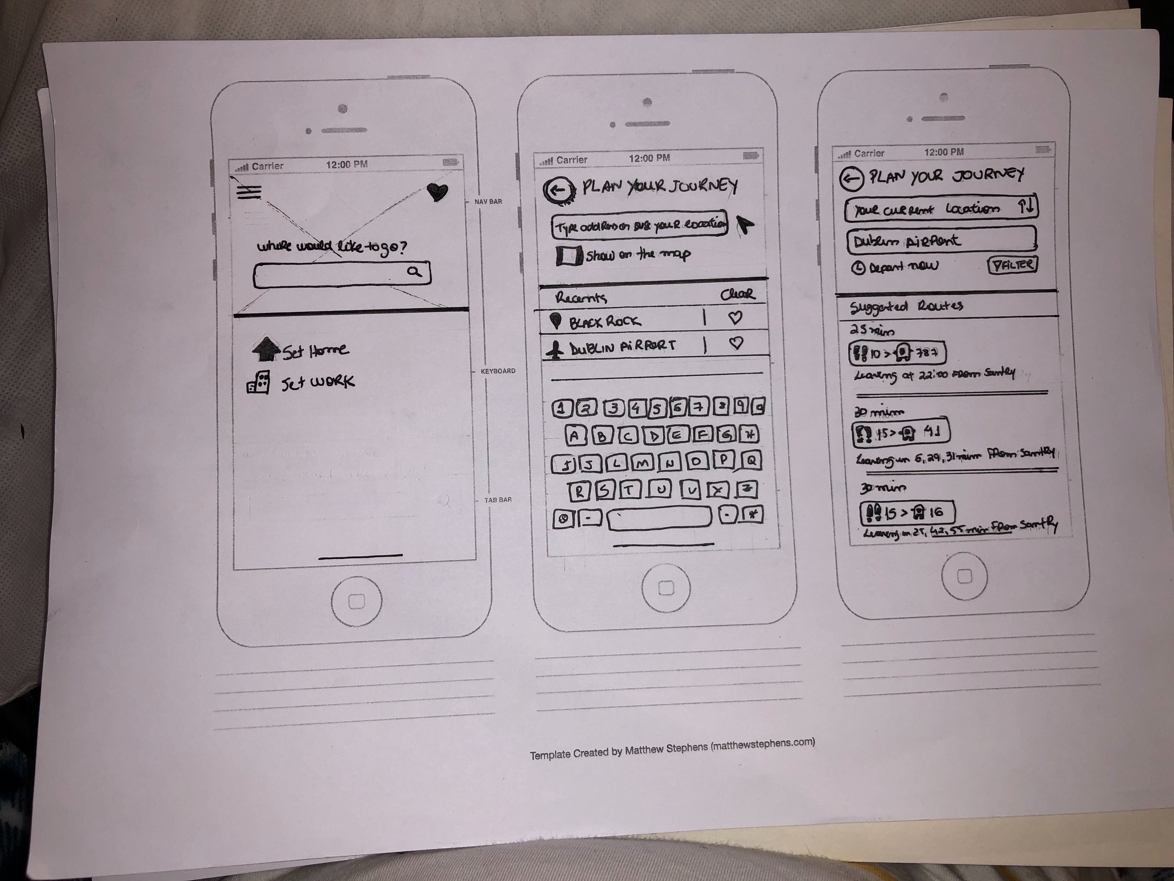
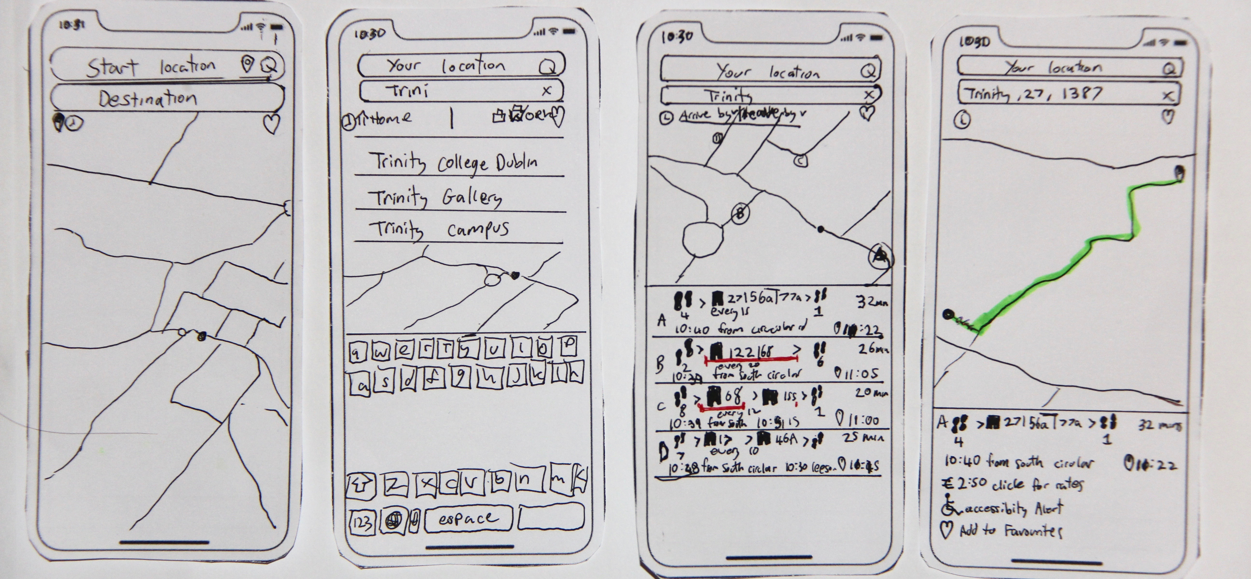
Providing autonomy for the user was a choice derived from reviewed features of analysed competitor applications. ‘Most recent’ and ‘selected favourites’ from Moovit, ‘arrive by’ and ‘depart by’ from Google maps are initially presented as icon recognition.
Non-transit applications that were reviewed for accessible and recognisable layouts were Airbnb and red colour was identified as a persuading pattern tool.
Notifications are a prime source of autonomy presenting user with a choice not to use the app and be notified when they are nearing their location with a pop up modal.
I conclude from further interviews at Dublin bus stops. Here are some features that with continued resources would be of next tier introduction to create intrigue which were welcomed solutions from commuters interviewed:
Design Feature Implementation
When Dominos introduced the Pizza Tracker in 2008, it instilled a degree of trust between commuter and client. Could installing a Dublin bus live tracker of a bus arriving to its stop be as exhilarating as a hot garlic base pizza? (Beer, 2014)
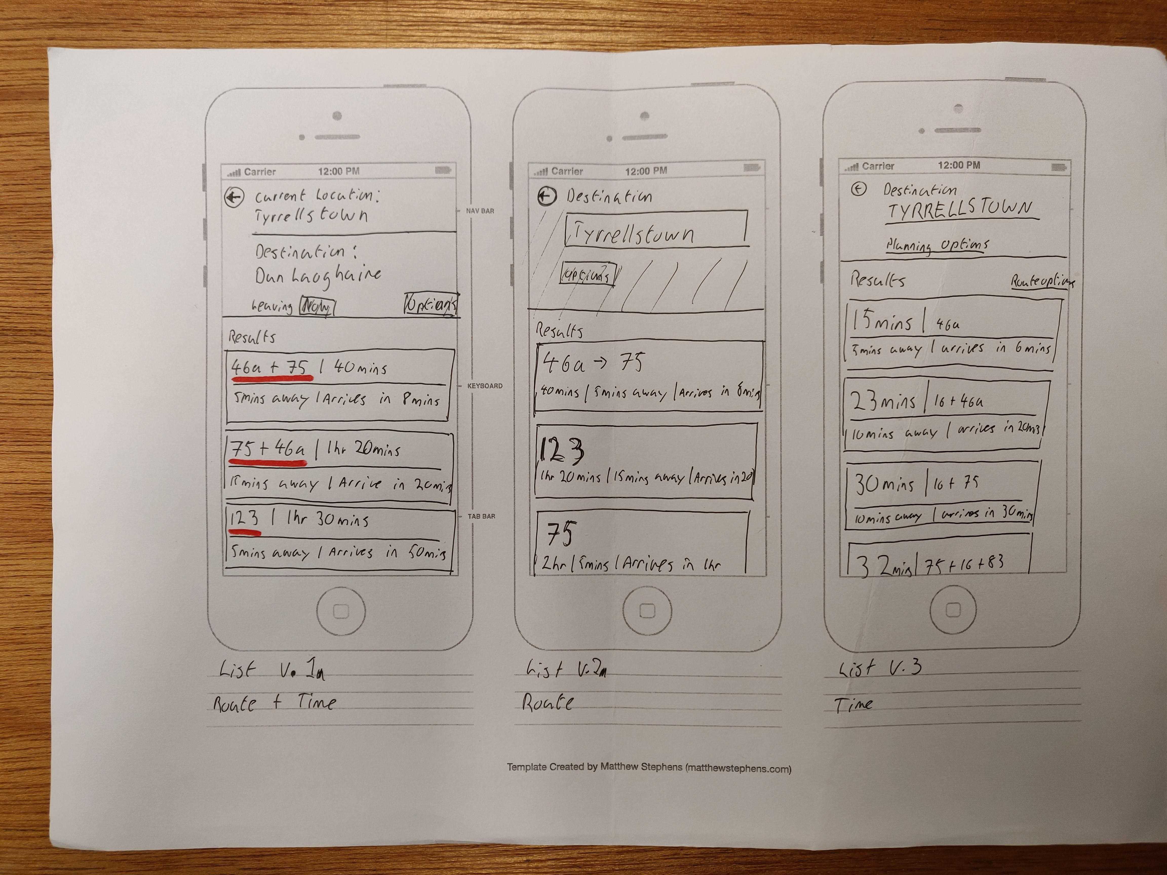
The Dutch Public Transport App NS indicates before a journey line has been selected if delays affect the journey and at what interval is disrupted, albeit providing alternative options. This brought up the issue of layovers for commuters. The proportion of Dublin buses commuters that do not meet their connection is 30%. Due to delays, no shows, traffic, accidents and slow uptake between stops with 90% of interviewed users revealing their reliance on the one bus to take them to their direction, it raises the implication for commuter trust. It appears Dublin bus does not provide users a layover suggestion with the highest catchment, but just the soonest layover, which increased dependence on their bus.
A visible timer taking precedence of the screen to display when you should leave the location in order to reach the destination. Inquiring with randomly selected commuters at Bus stop 1316, recipients voiced their support for a voice activated timer with intervals which suggested when to part the premise to be on time for the arriving transport. This option would give autonomy to commuters in routine journeys. (Rijdendetreinen.nl, 2010)
“So I could be brushing my teeth and not have to hold my phone in the other hand checking the time? Okay”
“I’m always running out of battery, that option could allow me to plug my phone in before work and not have to keep running to check the time”
First Testing
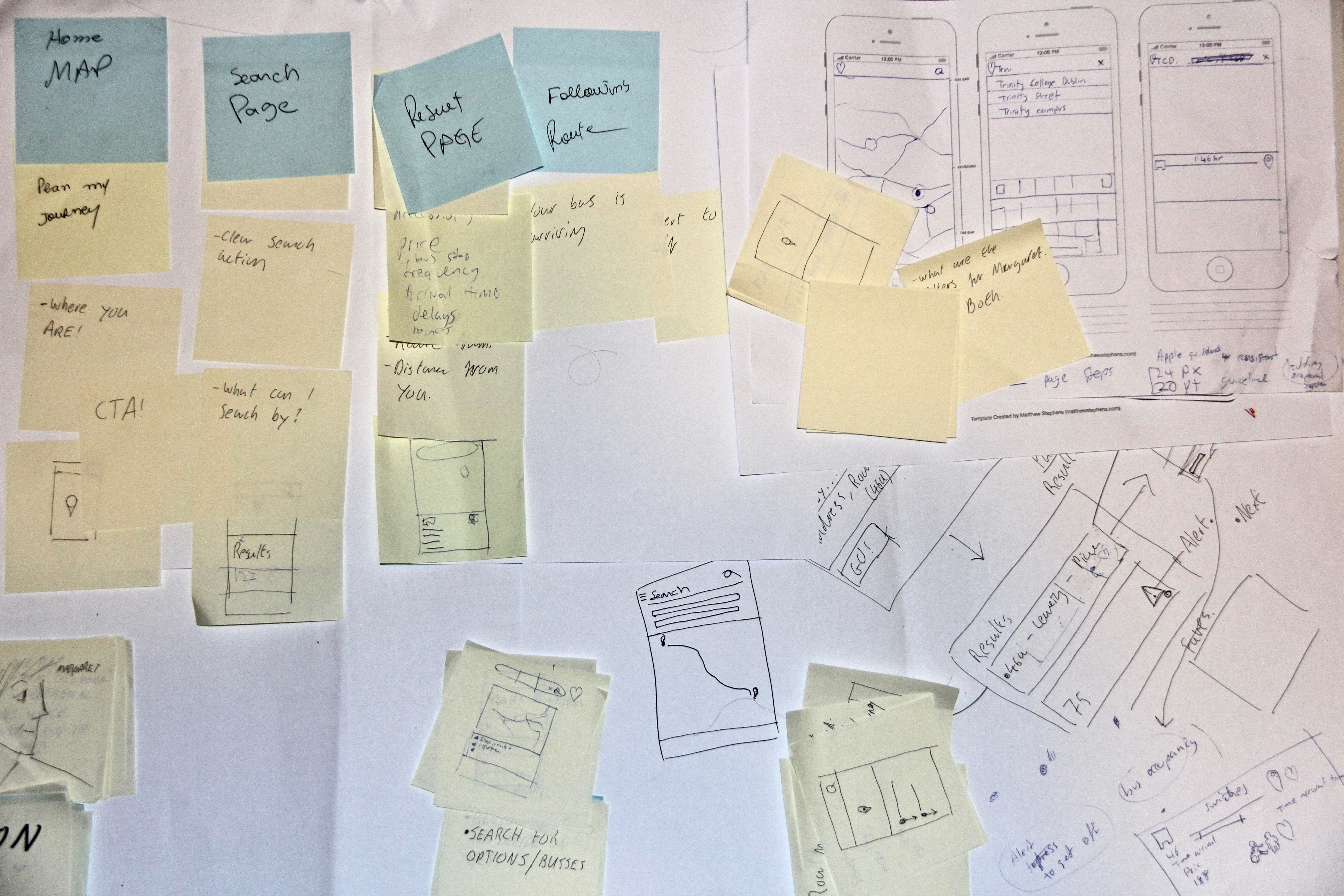
Based on our research, together we proceeded to brainstorm implementing solutions to the current design via paper prototyping. We found that the range of features and formats our individual designs summarised, showed the many directions this redesign could go. Taking note of consistency and standards we then separately approached resolutions based on the task flow. We then collated a set of features from each of our paper prototypes, this was to be our first app feature for testing. A drawback from our first paper prototypes was that the hand writing was difficult to read and inconsistent throughout different steps of the paper prototype, this made it hard for our users to engage with as an app in the space they would perform application tasks. White space and proportionate scalability of app features made it a slower process for initial user testing which we did not foresee.